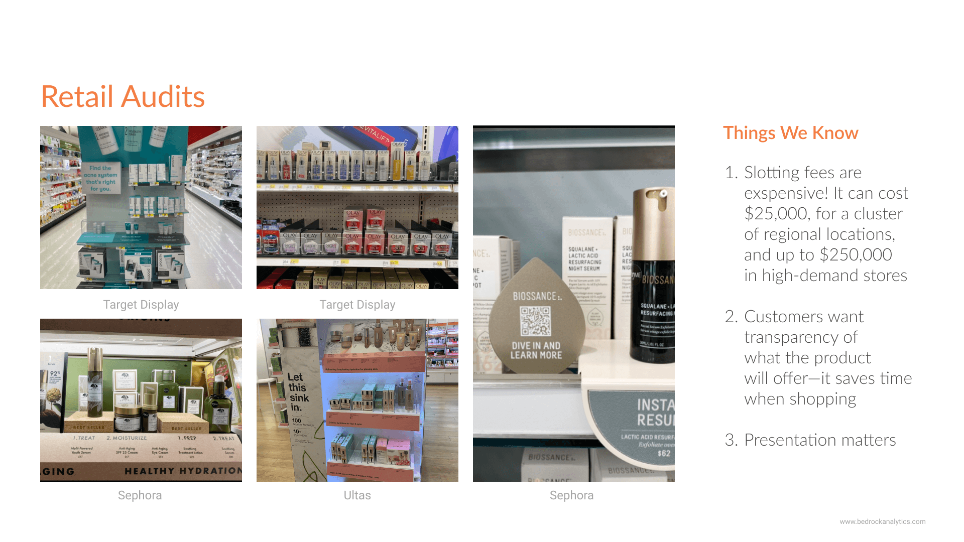
Because I was the User Researcher on the team, I was able to do a brand audit. I photographed, and looked at 30+ brands within Target, Ulta, and Sephora. There were several things I observed on site.
1) Brand Identity Matters. The competition is fierce, with unlimited options, it's important to create a packaging design that stands out and raises interest.
2) A clean and professional branding can increase consumer trust.
3) Providing clear instructions and information on ingredients is a huge priority for consumers. But they will do their research regardless.
Validating assumptions
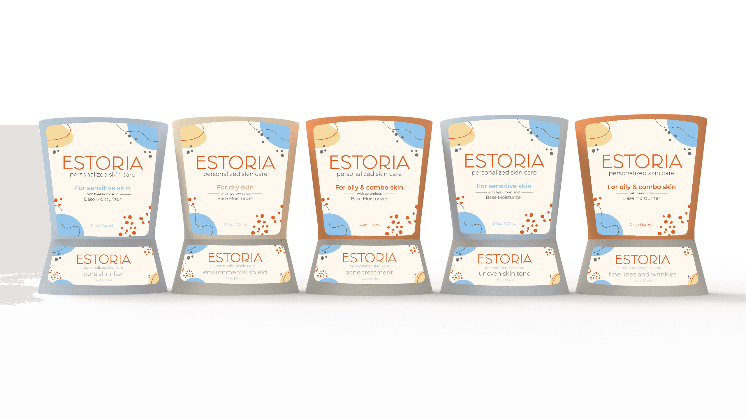
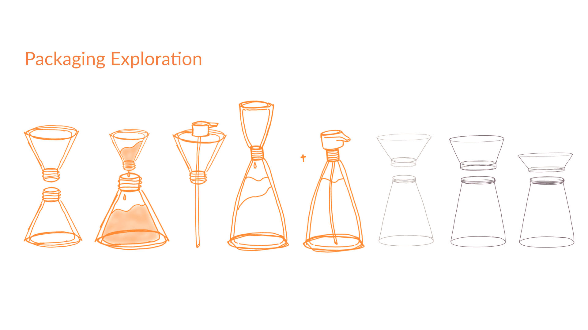
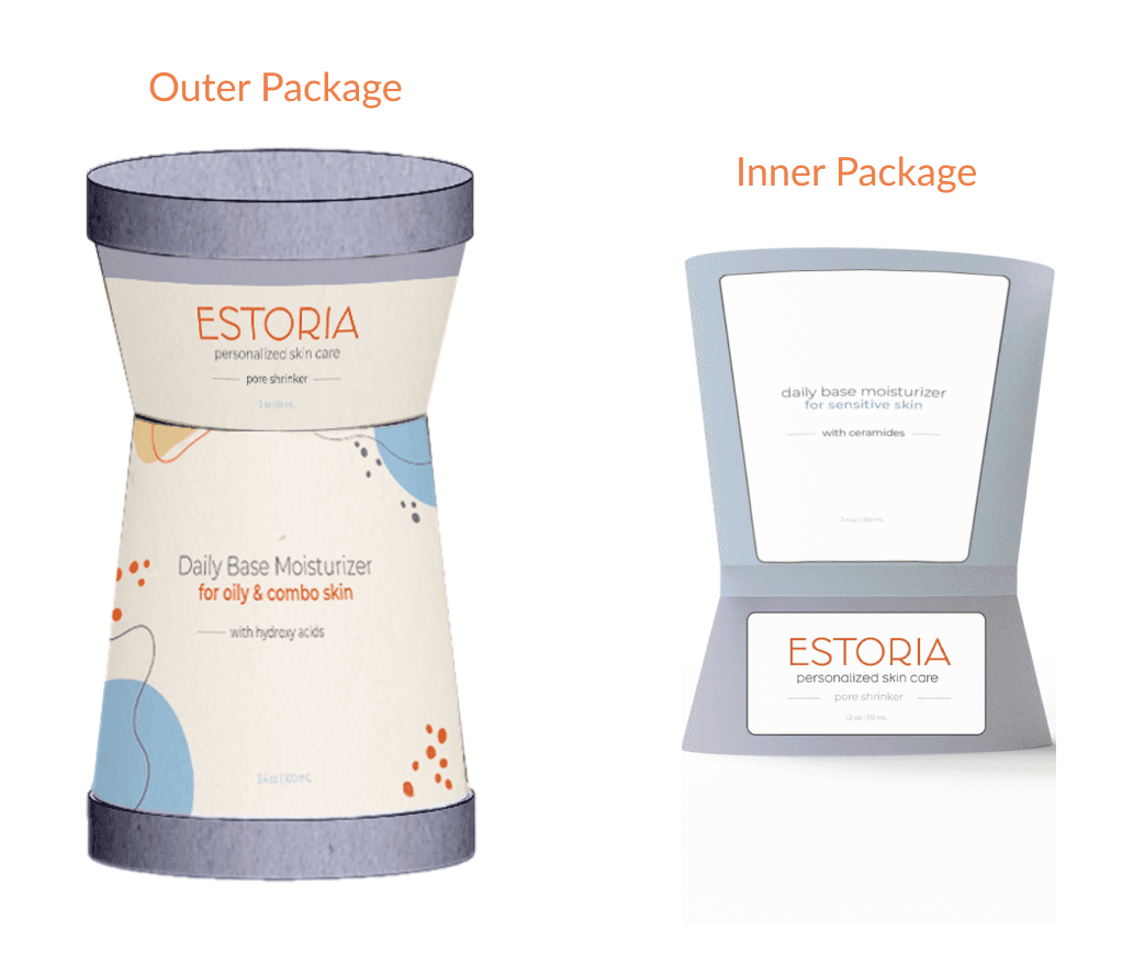
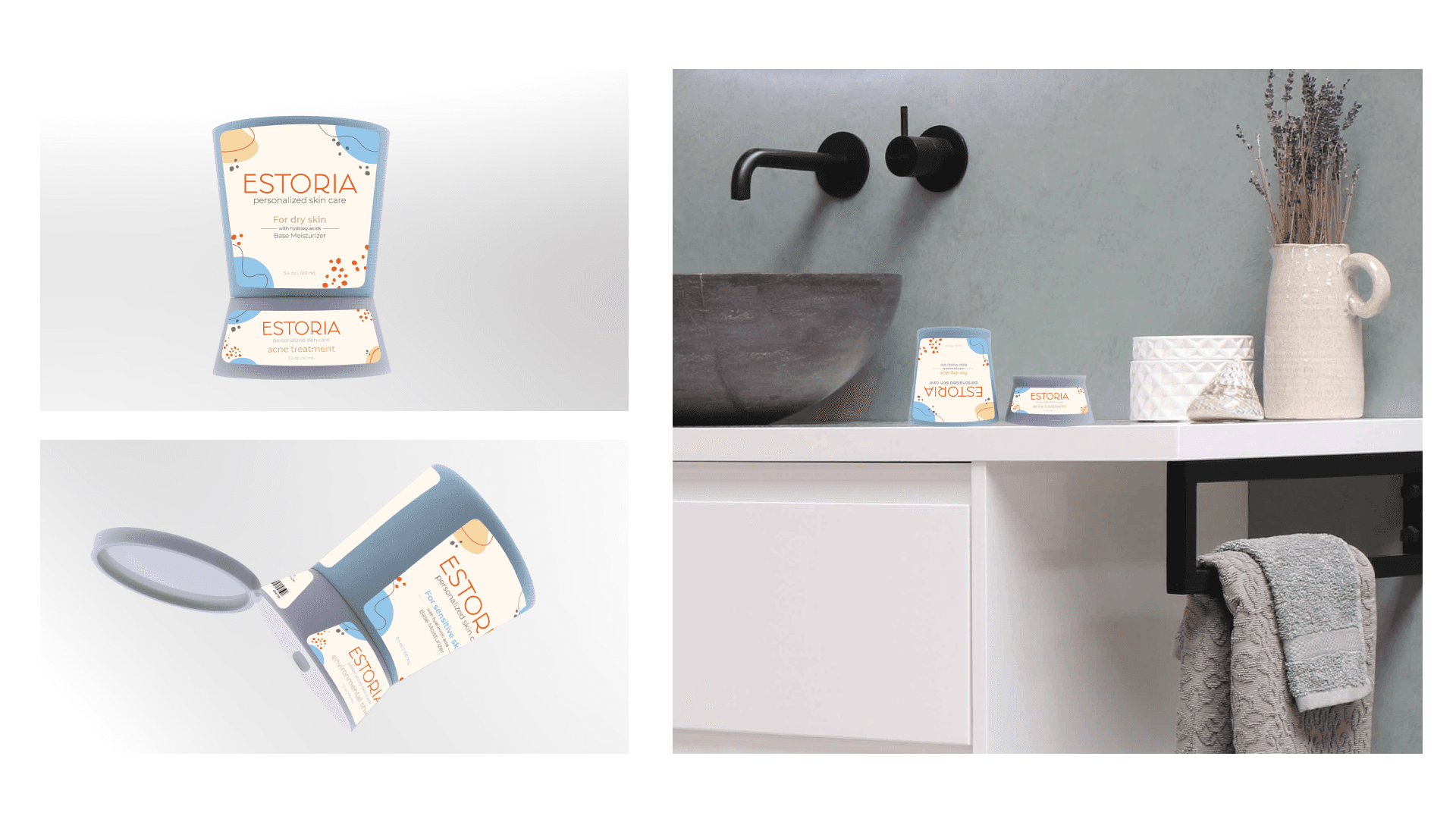
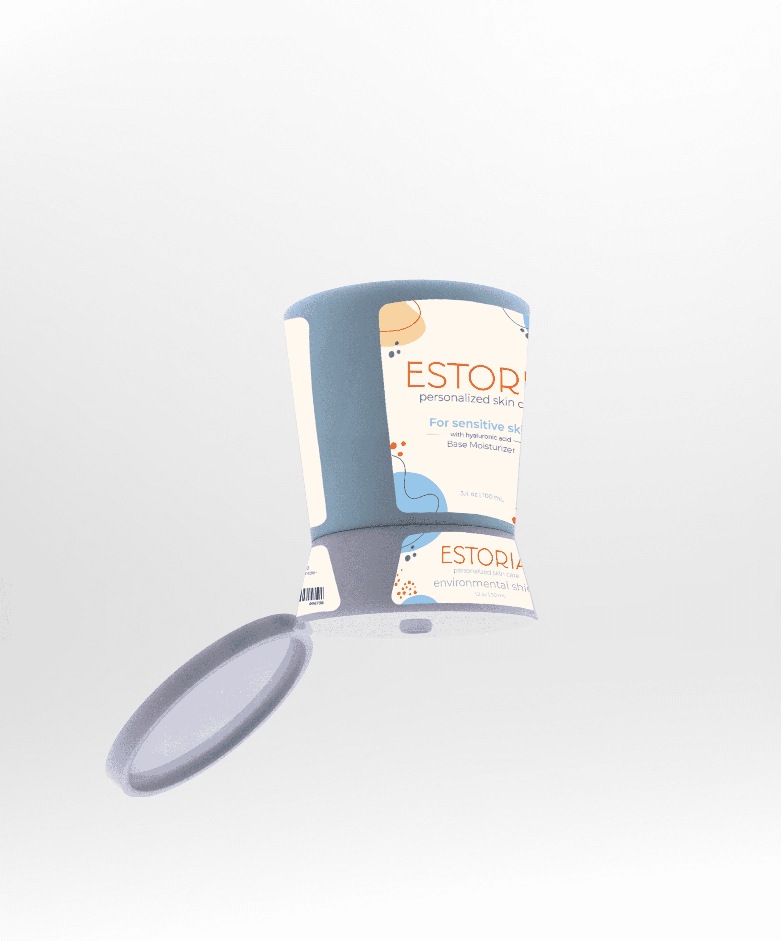
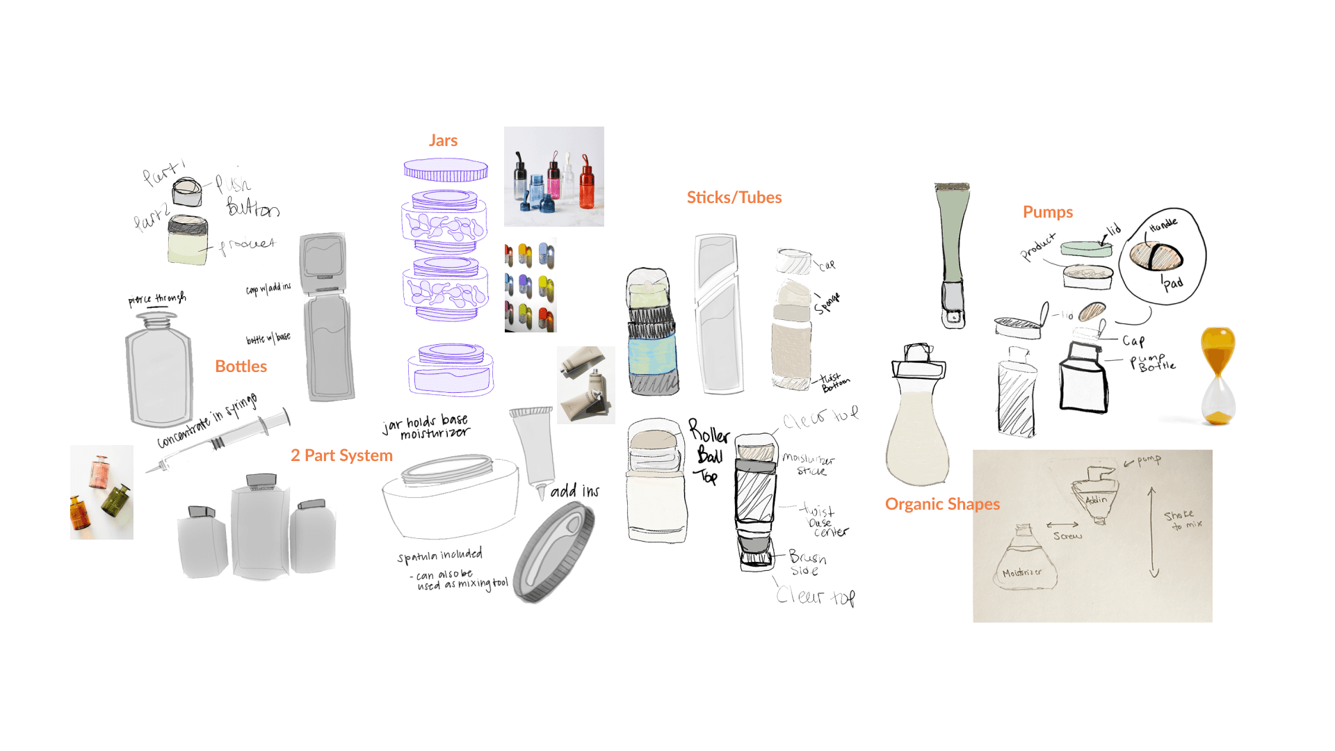
Although this was a team project I played an important role in the divergent ideation phase. We had tons of ideas, like dissolvable pills that could have serums in them. I had some ideas to use a rollerball stick to prevent the user from having to use their hand for application. There was talk about syringes...but it felt too medical. Ultimately, we landed on using a unique hourglass shape.
Supporting Research
eMarketer reports that buyers who valued quality the most were more likely to shop directly from a site (64%), while big-box stores won shoppers on price (28%).
Evaluating Competitors
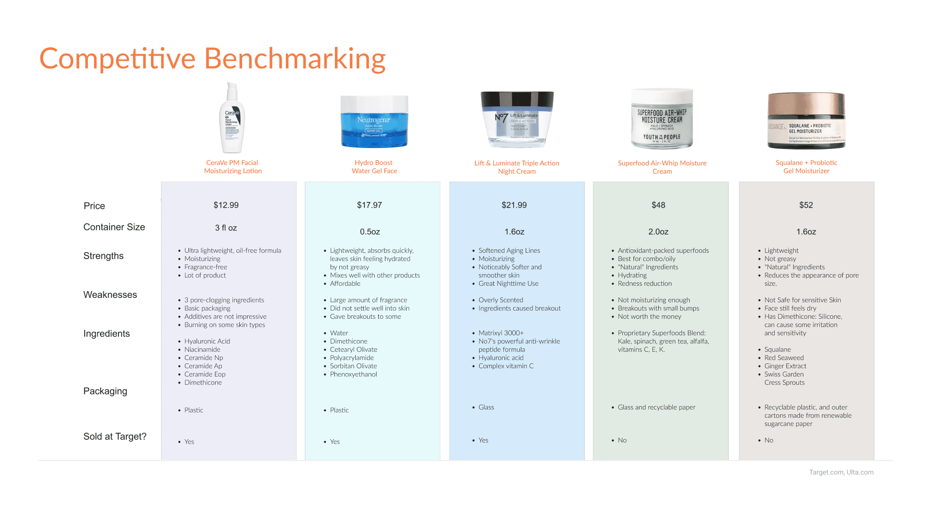
I looked at over 12 products that we considered competitors. These 5 have divergent qualities to that we want to learn from.
These 5 products fall under three categories Daytime, Nighttime, Gel Moisturizers.
Price Point
Prices for each product (low as $13-$52). our target audience is young professionals who care about their skin, so our product price would range from $26-$35.
As a team, research was a priority during the creation of Estoria Hourglass. We wanted to make sure to put our users first so we conducted a Google Survey to determine how people felt about skincare products and their motivations behind purchasing them.
What are Users
saying?
Learn More

Participant 1
“Most fragrances are too overpowering and smell super artificial.”
“Many scents trigger migraines.”

Participant 2
“I can't use fragrance products on my face due to sensitivity issues.”

Participant 3
“Fragrances often include more chemicals and alcohol products, which tend to dry out skin.
I like to keep it natural with more organic ingredients.”
1
Make it clear what's what,
base vs. add-in.
4
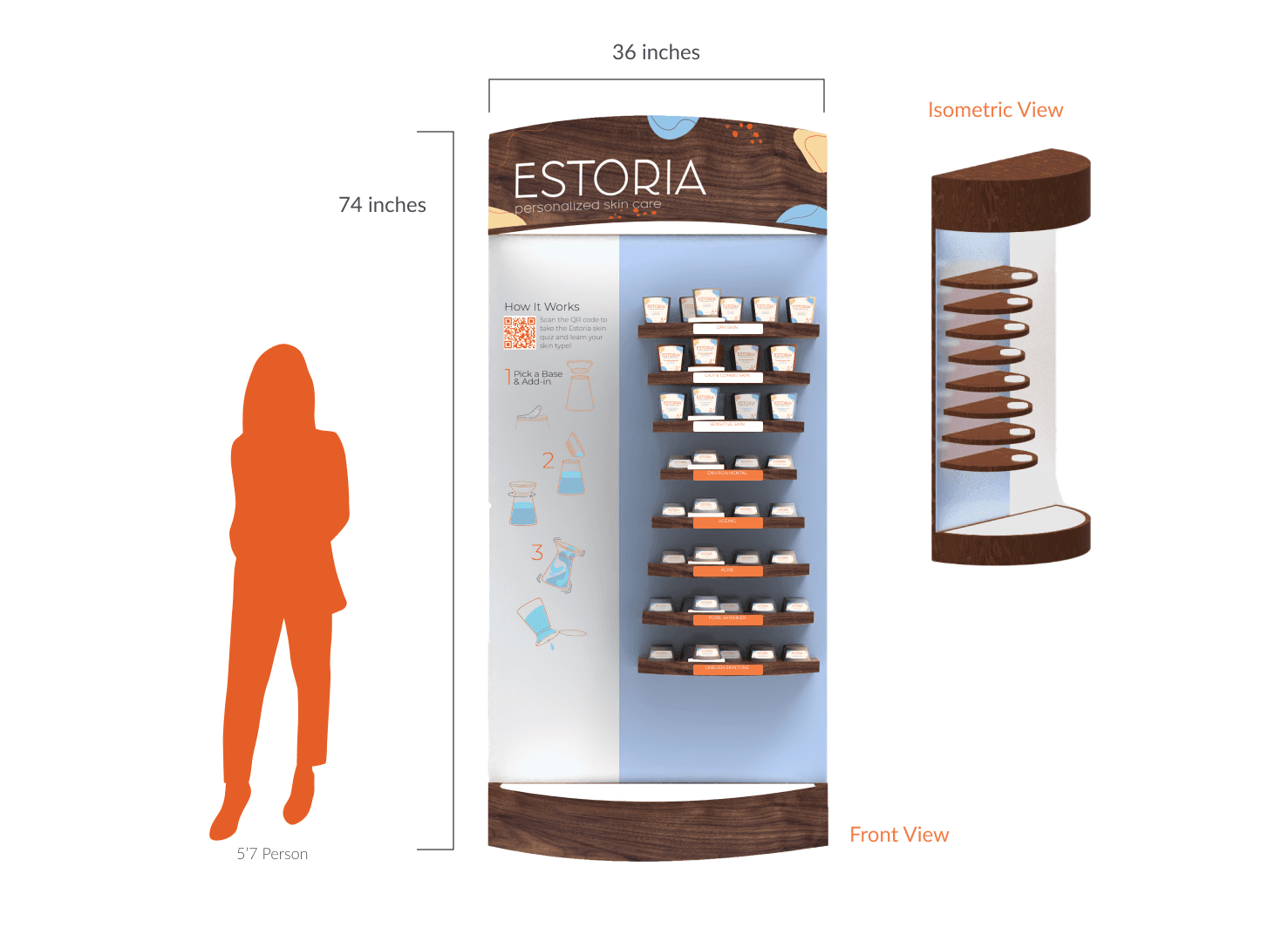
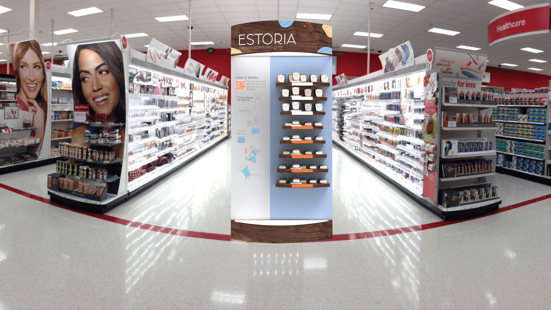
Include instructions on display endcap
2
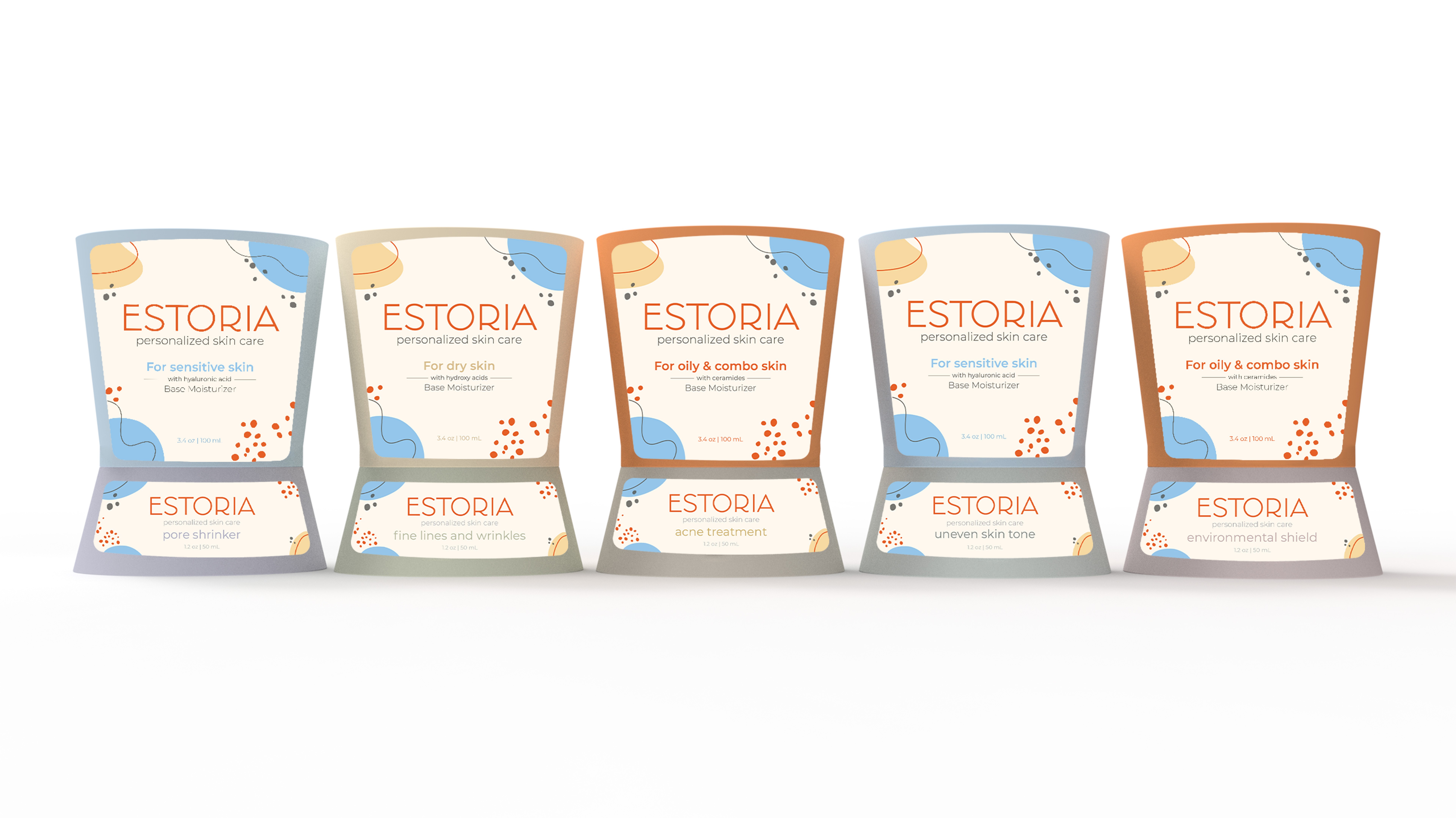
Have different colors for each
component (8 colors total)
5
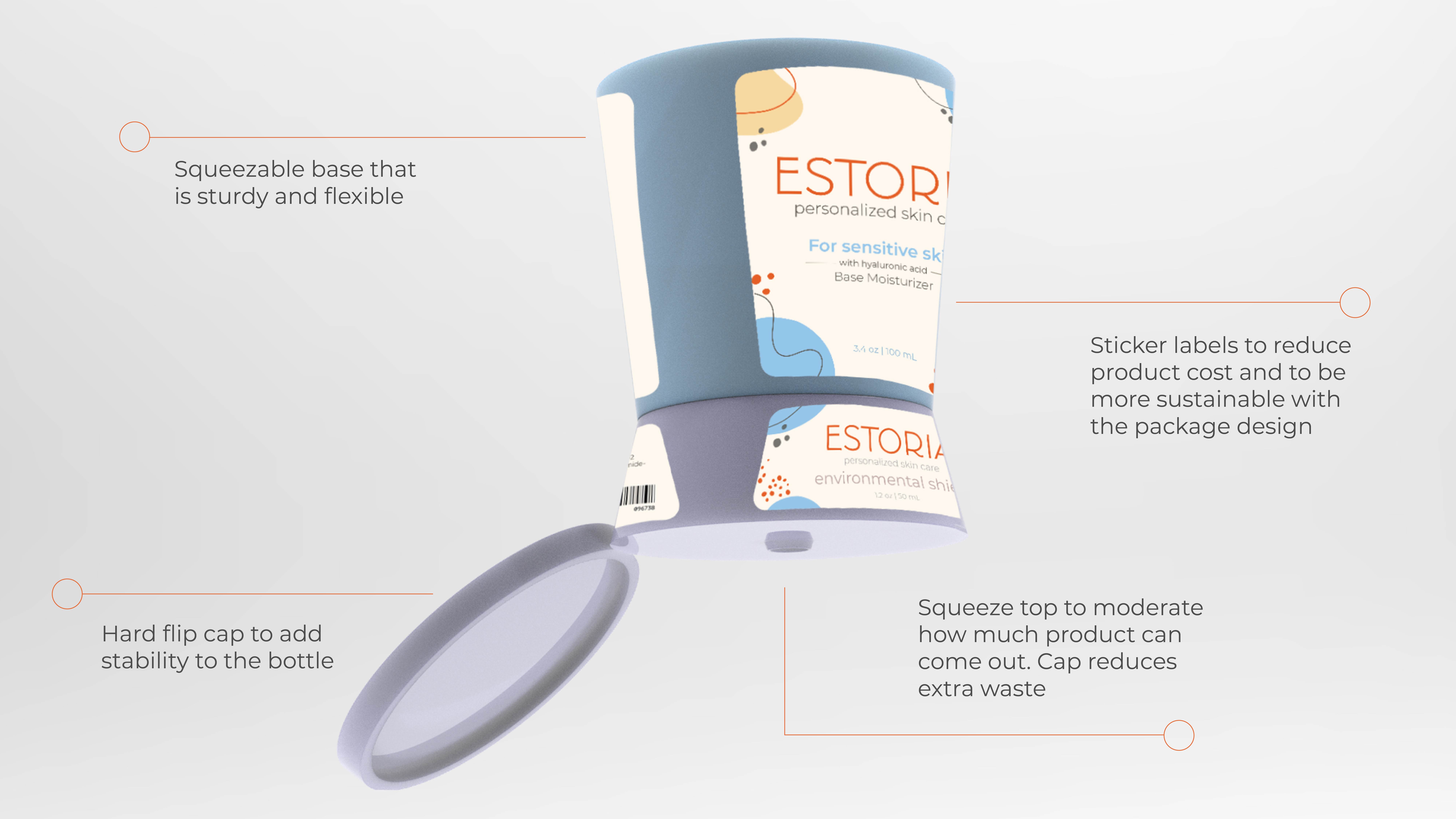
On the package if you do
stickers the edges need to
be rounded corners
2
On merchandiser fix contrast
of background color with
color of packaging
6
Labels are hard to read when
they're plain white
Version 1 outer package designed and rendered by Lauren Tompkins
1
The best design might be the simplest
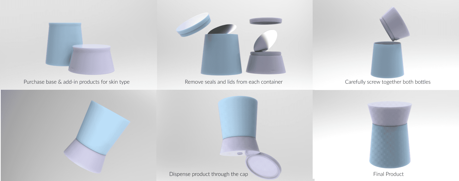
We made many versions but the most successful version was the one that was simplest. Users needed a clear call to action.
2
Keep going and sleep on ideas
During the beginning of the project we tried countless ideas to combine the 2 in 1 aspect. The syringe idea was cringe but it had a purpose..to get us to think out of the box. We came up with the hourglass after several days of divergent ideation.
In the end the shape solved all our needs!
Site built in Framer
Copyright© 2023.
